Wednesday, February 26, 2014

Crossroads


Crossroads had so many great elements bringing you inside of their store!! They had two hand-painted murals and three windows full of great items. The murals showed great diversity and had a swirl design framing the door. The colors worked well together and were eye catching. The signage was very clear and lets the customer know what they have to offer. The windows were also great! They used different crates to elevate the products to eye level. The hanging glass wind chimes were very eye catching and made the flow and proportion of the window work. All of the colors were not too overwhelming but were bringing your eyes to the product effectively!

Churchill's Formal Wear

 
Churchill's Formal Wear has a very effective window. From looking at the window alone you can infer that they sell Men's suits. The the left of the suits is a little table that was holding smaller mens accessories. The mannequins are symmetrical and very eye pleasing. The two on the outside are the same suit only in different colors while the middle suit was tailored a little bit differently and also in a different color. This keeps a great balance. The only thing I would personally change would be to bring the mannequins up a bit! They were a little bit below eye level and it was bothersome to my eye.

Behind The Glass

 
Behind The Glass is a fine art gallery and studio. Their window display really caught my eye! There are quite a few art galleries in downtown Bloomington and this display was my favorite. The window has great proportions and is set up very strategically. They used very detailed art work in bright colors to catch a passer-bys eye. They put the majority of the artwork at eye level with only a few pieces on the sides and bottom of the display. Their signage is small but still popped against the light blue background and frames the artwork very well. Overall a really cool display and very eye catching!

Burpo's Boutique

Burpo's Boutique's window clearly displayed a wonderful assortment of what they offer inside the store! From the window, you learn that they offer womens clothing and a wide variety of womens accesories. The items being displayed were directly at eye leveling making it very easy to view all of the smaller pieces. They almost had a "stair-like" display where the items went from short and small to bigger and taller in the back. The back of the display which is nearly impossible to see in the picture is mannequin with different color tops on! Though the window is packed full, it is not cluttered which keeps it pleasing to the eye.

Tuesday, February 11, 2014

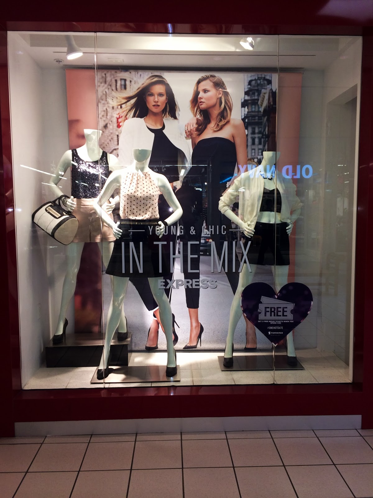
Express


Express had such great window displays! This one in particular was my absolute favorite. Because Valentines Day is this week, their display gave off a very romantic feel. They have the very large graphic but behind that, a pink sheet was hung. Just this simple little detail changed the whole feeling of the window for me! I could picture the mannequins going on a fun valentines dinner date in the city and then going out downtown right after. The mannequins also all coordinate with one another and the assymetrical positioning is very eye pleasing in this case. The lighting is PERFECT. Overall a very sucessful window by Express!

Gap

Gap's window display had great harmony and was very trendy for Spring time. Their color scheme was entirely pastels and focused on ombre which is predicted to be super popular again this season. The proportions of the window really worked well because they have the long ombre graphic, large window decal, and mannequins centered and symmetrical. They also really focused on layering! From left to right the mannequins seem to gain another layer of clothing but all still remaining really springy. The lighting was also fairly good in this window!

Earthbound Trading Co

Earthbound had a very effective window. The first thing I noticed was that the graphic was right as eye level. They had it lifted in a large frame so that the "Buy 2, Get 1 Free" lettering is right at your eyes. They also had the super cute jewelry displayed in such a fun creative way!! The bright colored paper backgrounds were very effective at getting a passer-bys attention and helping bring attention to the jewelry being displayed! Without the bright colored paper this display would not nearly be as successful.