Tuesday, April 29, 2014

J. Jill

 
J. Jill had a HUGE window to work with. Somtimes when faced with this big of a work area, the window can seem empty but in this case, I really liked the window and thought it was classy and well put together. The mannequins outfits coresponded so well with the signage in the back. They were put into groups of three to keep the balance and the middle mannequins were up on a box to add some variety and help with porportion and rythym. The onlt thing that I did not like was that the signage had no wording or any information about a sale or anything! I had to go around the corner to find out what store this was!

Coldwater Creek

I loved the black and white theme that Coldwater Creek incoorporated into their window display. The mannequins looked very well put together and sophisicated. I absolutely LOVED the fact that all three used the same print but in different ways and styles. The skirt, tank, and blouse all used the same white circular pattern. This little detail kept the emphasis on the mannequins. The mannequins were staggered a bit and put at different angles. This was important for the balance on the window.

Christopher & Banks

Christopher & Banks also used the same signage tactics as Justice did! They have the most attractive part of the sign in the largest and brightest font to get the customer inside. The fine details were in smaller print underneath stating that the deal was only good for card holders. This is often very misleading to the customer but does get them into the store most of the time and will even sometimes lead to a purchase. I thought that the porportions to this window were great and I liked that the mannequins were all at eye level. They were staggered a bit which was visually pleasing and helped them seem not so cluttered. The way the mannequins are styled clearly shows what kind of clothing and brand personality that Christopher & Banks has. This window would stear a college aged girl away, but would bring in a teacher, bank teller, or any other professional woman. This is what the display aimed to do and it was a success!

Justice

Justice didn't have much window room to work with, but what they did do was effective and highlighted all aspects of design. The signage being elevated gave the window good balance and porportion. The mannequins being the same height have the window good rythym and the signage and mannequins had the greatest emphasis in the window. You were not distracted at all by the store in the background because the window was so strong! The colors in the window were bright and springy! The "40% off entire store" on the signage was the brightest color on purpose to attract the customer eye. In very very little print that you can barely see from this poster was the details of the sale, that weren't as good as you thought! This is a tactic that many retailers use to get customers in the door.

Wednesday, April 23, 2014

Express Men

Though this display window is small, it is very effective! I liked that the signage on the front window and graphic in the back were centered, and the two male mannequins were off to the side. Though this makes the window very asymmetrical, I thought it really worked. The mannequins were off to the left so the male in the graphic is clearly seen. The tiny tiny window shows off three entire male outfits (VERY impressive) without feeling cramped and messy. Overall I thought this window really shined even compared to the amazing female clothing next door.

Wednesday, April 16, 2014

The Limited

The idea and theme of The Limited's window display was so cute! Each basket had correspoding colored tops that just made you want to go inside and try them on. Lets not forget that the deal with these tops is buy one get one FREE! How can you pass that up!? The tops were at eye level and as you walked by the store window your eye moved from fixture to fixure with ease. After looking at other window displays the past few months, I realized one aspect that would've helped this window become the best it could be. The window needed a simple backdrop! The signage would've popped so much more and not blended into the store against a lighter color background.

Bath & Body Works

Even though Bath & Body does not carry clothing items, their window still displayed all the characteristics of design very well. The proportions in the window were perfect! Placing the cake stands up on a table put all of the products at eye level and filled the window perfectly. The theme of the window displayed BBW's new line so well! Their new products are all scents that you would smell in a Sweet Shop and walking by and looking at the display makes you want to go inside and smell the delicious smells. The signage was well balanced and the color made the words pop. The emphasis on the window is first on the signage and then it moves to the product. Bath and Bodys window is a great example of an effective display window!

American Eagle

I think American Eagle's window gives off a very summery vibe! I loved the mix of the different styles of clothing (some casual and some a little dressier) The BEST part about this window is that all of the looks were styled by the workers of the store, not from corporate off of a planogram. The workers got to put their names on the front of the window stating which mannequin that they styled. The balance of the window is great and your eye naturally moves from left to right. The signage is absoltely perfect! The letters POP and the heart frames the mannequins and words perfectly. Overall super great window!

H&M

I cannot get over how cute this window display was! It brought me right into the store to purchase the skirt on the third mannequin from the left. This is the ultimate goal and purpose of a window display and it worked on me. The balance and rhythm to this window display are great. A customers eye flows from right to left and ultimately ends up at the NEW signage. The backgroud is simple but interesting at the same time. It doesnt take away from the mannequins and adds to the entire feel of the window display. All of the outfits on the mannequins are very stylish and correspond perfectly. Though it used a lot of black and it didn't "scream" Spring time, it was so cute and is one of my favorites so far!

Gap Kids

I loved the sweet little styled outfits for the Gap Kids window display. The colors were so cute and brought my attention right away to the pants. They corresponded with Gap so well and looked great next to each other. The theme is super Springy and fresh. The large ombre poster in the back helped to make the signage on the front window pop! The poster also helped with the windows balance and porportion. If it would not be present, you would be able to see directly into the store and the window would look very empty. It is amazing how much a backdrop can change an entire window!

Tuesday, April 1, 2014

Francesca's

Even though Francesca's windows were filled with a lot of items, I thought that they were cute and showed exactly what the store has to offer. All of the outfits coordinated with the jewelry and other accessories in the display. Francesca's used a lot of boxes and different sized necklace displays to keep the rythym of the window moving so your eyes move from left to right and from the bottom up. I also liked that the displays were black. This kept the emphasis on the vibrant necklaces and purses.

Loft

The Loft's window got an A+ in all aspects of design! The balance of this window is so eye pleasing to a passer-by. The color scheme of the entire window gives the customer the feeling of Spring even when its cold out. I also really liked the mixture of textures in the clothing on the mannequins. The signage was my all time favorite aspect to this window!! It is kind of hard to see but it is a huge picture of a girl smiling with her hair flowing in the wind. It gives the the customer such a warm and happy feeling. The smaller signage was aimed to promote the dress on the mannequin. She is wearing an eyelit dress and the signage says "All Eyes on Eyelet" Super catchy and cute!


Chico's

Chico's always has great windows and this was just another example of one! It was extremly eye pleasing and makes you want to go inside. The color tones in the window and neutrals and keep you feeling relaxed. The part that I liked the best about this window is the use of the different types of signage. The main sign in the back acted as the inspiration for the mannequins outfits and accessories. I viewed it as being the mood board for the entire window! The lifted mannequin in the back gives the window great proportion! I think I liked the scarf and necklaces on the blank canvas the best. I have never seen anything displayed this way before and it really poped! Such a cute idea to keep in mind for my future merchandising career :)

Dressbarn

 
Dressbarn had the cutest outfits picked out for their mannequins! They all matched so well and were very eye catching. The GREATEST part about the mannequins is that they were all different sizes :) This is the first time I have seen a variety of different sizes on display and I absolutley loved it. It is more appealing for the Dressbarns target market which is women ages 20-50. They can see how good they will look in these dresses even if they are not a size 2! The only thing missing from this window is some good signage! They could've put a large white sign with a blue tag line to distract a passerbys eye from looking into the store. Overall this window had great balance and and proportion. The mannequins are at eye level and the outfits are TOO CUTE! 

Wednesday, February 26, 2014

Crossroads


Crossroads had so many great elements bringing you inside of their store!! They had two hand-painted murals and three windows full of great items. The murals showed great diversity and had a swirl design framing the door. The colors worked well together and were eye catching. The signage was very clear and lets the customer know what they have to offer. The windows were also great! They used different crates to elevate the products to eye level. The hanging glass wind chimes were very eye catching and made the flow and proportion of the window work. All of the colors were not too overwhelming but were bringing your eyes to the product effectively!

Churchill's Formal Wear

 
Churchill's Formal Wear has a very effective window. From looking at the window alone you can infer that they sell Men's suits. The the left of the suits is a little table that was holding smaller mens accessories. The mannequins are symmetrical and very eye pleasing. The two on the outside are the same suit only in different colors while the middle suit was tailored a little bit differently and also in a different color. This keeps a great balance. The only thing I would personally change would be to bring the mannequins up a bit! They were a little bit below eye level and it was bothersome to my eye.

Behind The Glass

 
Behind The Glass is a fine art gallery and studio. Their window display really caught my eye! There are quite a few art galleries in downtown Bloomington and this display was my favorite. The window has great proportions and is set up very strategically. They used very detailed art work in bright colors to catch a passer-bys eye. They put the majority of the artwork at eye level with only a few pieces on the sides and bottom of the display. Their signage is small but still popped against the light blue background and frames the artwork very well. Overall a really cool display and very eye catching!

Burpo's Boutique

Burpo's Boutique's window clearly displayed a wonderful assortment of what they offer inside the store! From the window, you learn that they offer womens clothing and a wide variety of womens accesories. The items being displayed were directly at eye leveling making it very easy to view all of the smaller pieces. They almost had a "stair-like" display where the items went from short and small to bigger and taller in the back. The back of the display which is nearly impossible to see in the picture is mannequin with different color tops on! Though the window is packed full, it is not cluttered which keeps it pleasing to the eye.

Tuesday, February 11, 2014

Express


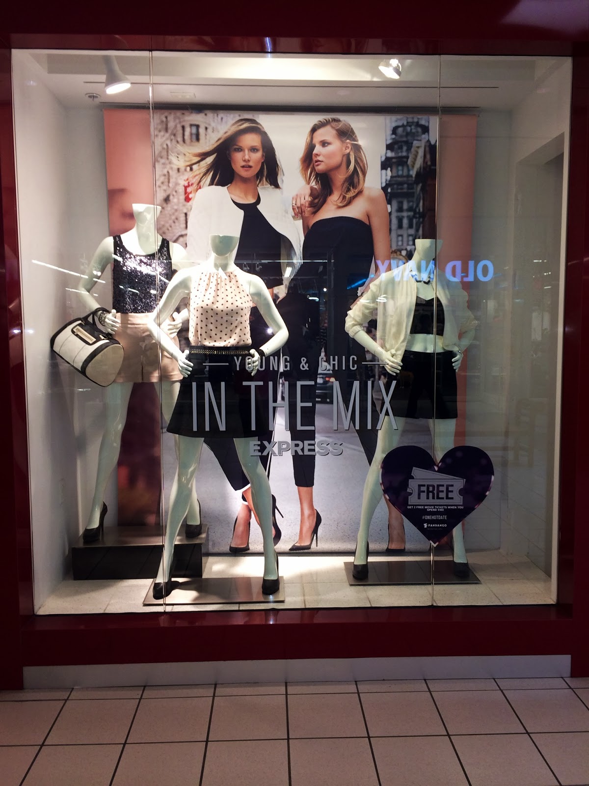
Express had such great window displays! This one in particular was my absolute favorite. Because Valentines Day is this week, their display gave off a very romantic feel. They have the very large graphic but behind that, a pink sheet was hung. Just this simple little detail changed the whole feeling of the window for me! I could picture the mannequins going on a fun valentines dinner date in the city and then going out downtown right after. The mannequins also all coordinate with one another and the assymetrical positioning is very eye pleasing in this case. The lighting is PERFECT. Overall a very sucessful window by Express!

Gap

Gap's window display had great harmony and was very trendy for Spring time. Their color scheme was entirely pastels and focused on ombre which is predicted to be super popular again this season. The proportions of the window really worked well because they have the long ombre graphic, large window decal, and mannequins centered and symmetrical. They also really focused on layering! From left to right the mannequins seem to gain another layer of clothing but all still remaining really springy. The lighting was also fairly good in this window!

Earthbound Trading Co

Earthbound had a very effective window. The first thing I noticed was that the graphic was right as eye level. They had it lifted in a large frame so that the "Buy 2, Get 1 Free" lettering is right at your eyes. They also had the super cute jewelry displayed in such a fun creative way!! The bright colored paper backgrounds were very effective at getting a passer-bys attention and helping bring attention to the jewelry being displayed! Without the bright colored paper this display would not nearly be as successful.

Aeropostale

 
I absolutely adored Aeropostal's window! I though that they were super trendy and chic. The window is extremly balanced and clean. The large graphic is perfectly centered as well as the window decal. Having a male and female mannequin on both sides also kept it balanced and eye pleasing. The lighting in this window is also great because the most emphasis goes to the "50% off everything" sign but the mannequins are also lit up. This is important because behind the mannequins is the distracting store but the lighting and well put together outfits keep your eyes on them! The window is successful in letting the passerby know that they are having a sale and that they offer men and womens clothing.

Sunday, February 9, 2014

Prada

So sophisticated! Prada's window breathes expensive. The lighting is perfect as well as the window proportions. The mannequins are perfectly symmetrical and the clothing goes great together. Bringing in the printed pant and colorful necklace helps break up the harsh black and white color scheme. The colors in the necklace and pant match to perfection making this window have great balance and unity.

Forever 21

 
The graphic says it all! "DRESSES starting at 8.80" Who wouldn't want to get an adorable dress for such a steal. I absolutely loved what Forever did with the mannequins though. They are all symmetrical and doing the same exact pose and in the same exact position. What Forever did though was styled each dress to perfection! They put a spin on each dress that I LOVED. One of the mannequins was dressed down, one was dressed up, and one was just a casual going out dress. They threw on a blazer, sports jacket, and dazzled the other with lots of jewels. It helped me as a future customer to think of how and where I could wear a dress. Such a great example of creative smart styling!

J Crew

 
Such a sweet window display by J Crew! It really gives the cool vibe of the store just by looking at the display. The hanging tassles are a cute DIY decor that helps bring your eyes from left to right. They create a horizontal rhythm to the window. The mannequins on the crates create an eye pleasing assymetrical design that correlates well with the swooping tassles. Not everything is perfectly level and window viewers tend to like that. The male and female mannequins show a future customer that they have clothing for a man or woman. When I picture a J Crew model I definetly image them wearing these outfits so they did a great job portaying their stores identity through this window.

Tory Burch

 
The lighting in this window is absolute perfection! It made the clothing and jewelry look oh so good and reflected off of the gold hanging Tory logos behind the mannequins to catch a walker-by's eye! The mannequins are symetrical which is very pleasing to the eye and the proportions of the window are great. The clothing's color scheme is too cute and makes the viewer almost feel that spring is coming. A customer and clearly get an idea that Tory offers womens clothing, jewelry, and handbags. Overall a super cute window!

Wednesday, January 22, 2014

Campustown

This window display may seem pretty plain but it is actually more thought out than you might think! Campustown is the ONLY store in Uptown that has male clothing on display. The clothing in placed in a clean, straight line that is easy to scan your eyes across. There is not one shirt that is the same color in the entire window display. They also have all different sizes of clothing on display in the window so the customer knows what they all have to offer. The bottom displays were accessorized with hats, gloves, scarves etc. Each shirt has a different saying or logo, switching between ISU themed t-shirts to Bloomington-Normal themed shirts. It may not be the most creative looking window out there but boy is it effective!

The Pod

I have personally never been to The Pod so this was super great for me to try and figure out what they have to offer just by looking at their window display. I interpreted that they would be sort of a gift shop that carries women clothing and accessories as well as other odds and ends. After looking them up this turned out to be spot on! Their window was not misleading at all and works perfect for the little type of shop they are. I really liked the bold print on the dress to catch the customers eye and I also liked all the blingy jewelr.! It was hard not to study the inricate necklaces! The Pod's window was great and eye catching.

Uptown Gifts & Accessories

 
I LOVE Uptown Gifts & Accessories and I feel as though their window display fits them perfectly! The store has so many cute things inside and the window helps show the customer the vibe of the store. "A gift for everyone on your list." This is a very strong saying to put on your window and works for EVERYONE! I have personally bought my managers gifts from there and also received a few from my boyfriend. The saying fits for everyone, especially boyfriends or husbands in need for a last minute thoughtful gift for their significant other. The window has a very springy feel and had just about everything in it. The two dresses on the mannequins had bold patterns and the jewelry was in very bright colors making the eye go straight to it. Behind the mannequins was almost a "wall" of scarves hung on a shelf. Not only did they have clothing and all sorts of accessories in their window, they had candles and lotion. (Something every girl just cant pass up!) Uptown Gifts & Accessories window definitely stood out.

Apricot Lane

 
 I think that Apricot has a very strong window display. It absolutely gets the point across that they are having a big sale! The color of the tape is key to attracting the customer. The white lettering and red background contrast well and are easy to read. The mannequins are shaped in a womanly figure portraying that it is a womans clothing boutique. The tops of the mannequins were made into different neck lines giving the look a little more class than just having the tape wrapped around the entire mannequin. The window also contained the store hours and a flyer for TOMS (as pictured here) to help give the customer vital info about the store. All of the mannequins were facing forward and the windows were not cluttered! Apricots windows were great and straight to the point.